One Practical Use of CSS3's nth child
February 19, 2012 • by wes
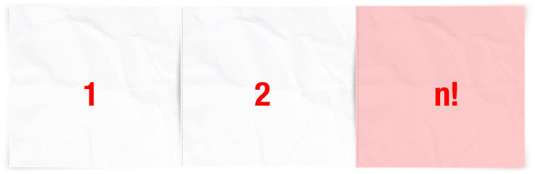
The dilemma… one of our designers recently presented me with this:
It represents one row in a list of filtered items, or three <li>s to be precise. Depending on how many items are returned, there could be one, two or three in the last row.
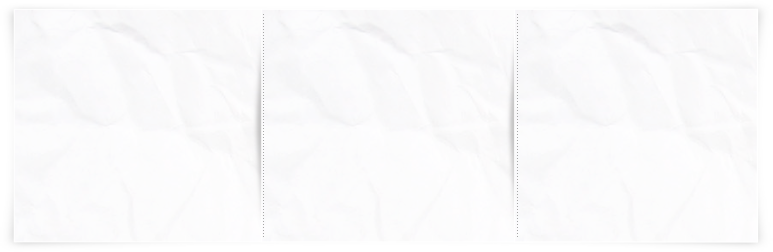
Look closely.
 See the shadow between each item? See how it spills over onto neighbouring items? If there is a neighbouring element to the right, it casts a shadow on to the element to the left, while the last item in the row has no shadow. Also, the paper background is subtlety different for each slot in the row. Yeah, it all looks great, but how is this going to work in practice? Couldn’t each <li> just have the same background – with the shadow – and uh, we’ll hope it won’t be too weird for the last element in the row? A mere CSS apprentice would probably cave and go this route.
Here’s a neat trick. Rather than slicing up the image and trying to finagle each slice onto the first, second or third element in the row by appending different classes to every <li>, we do the following:
-
First, we remove the shadows between items from the image (thankfully, this entails simply deactivating a layer in Photoshop)
-
We also leave the image whole, in its entirety. No slicing. This in itself is quick and easy.
-
We take this image and assign it as the background to every <li>.
-
We offset it in each item using the handy nth-child selector. (What, not supported in IE? No problem, we’ll come to that.)
First, though, let’s define the html structure we’ll use:
<ul class="paper">
  <li><div>...</div></li>
  <li><div>...</div></li>
  <li><div>...</div></li>
  ...
</ul>
And, some general styles for each li, as follows:
ul.paper li {
  background: url('images/paper-list-items.jpg') no-repeat;
  float: left;
  padding: 10px 0;
  margin: 0 -6px -10px -6px;
Note that we have negative margins. This is because I want each element to overlap by 12px (margins only collapse vertically, so -6 and -6 will add to -12px, here). We see that I’ve also set the background image, and have floated each element.
Next, we add the shadow in. We’ll use the child <div> for this purpose – we don’t necessarily want to always see the shadow and want to be able to style it independently, so we don’t use the parent <li> for this. While we’re at it, let’s add some padding and define the dimensions:
ul.paper li div {
  background: url('images/list-item-shadow.png') 0 0 no-repeat;
  padding: 30px 30px 20px;
  width: 200px;
  height: 180px;
}
Okay, so at this point every element looks the same. We haven’t done anything fancy just yet, although the shadow that we just added will appear on top of the element to the left because we’re overlapping each <li> a little bit. Now, using the :nth-child selector, we shall make this look and behave as we’d expect.
Basically, the :nth-child selector allows you to target only certain items in a long list of elements. For example, we could add styles to every 2nd element, every 7th element, only odd elements… or whatever we wanted, really, using the some fancy filtering syntax. In this case, we want specific styles for the first, second and third elements. Because this design has 3 elements per row, we’ll want to target every third <li> accordingly. Part of the syntax for targeting the first, second and third elements of a row “n” looks like this:
3n - 2 /* every third element, minus 2 */
3n - 1 /* every third element, minus 1 */
3n     /* the 3n means every third element */
And the complete css would then look like this:
ul.results li:nth-child(<strong>3n-2</strong>) { }  /* first in row */
ul.results li:nth-child(<strong>3n-1</strong>) { }  /* second in row */
ul.results li:nth-child(<strong>3n</strong>)   { }  /* third in row */
(We don’t actually need to add any styles for the first <li> element in each row (as the default background position is always top / left), but I wrote the filter syntax for completeness).
Let’s now fix the background positioning for each <li>:
ul.results li:nth-child(3n-1) { background-position:50% 0; }
ul.results li:nth-child(3n) { background-position:right 0; }
And finally, let’s ‘nix the shadow background on the first element of every row:
ul.results li:nth-child(3n-2) div { background:none; }
Putting it all together, we use only one big background image and offset it appropriately for each <li>, and we then add a paper-shadow image to only the second and third elements in every row:
ul.results li:nth-child(3n-2) div { background:none; }
ul.results li:nth-child(3n-1) { background-position:50% 0; }
ul.results li:nth-child(3n) { background-position:right 0; }
I also mentioned that this will work with IE. Well, the solution isn’t anything fancy, I’m afraid. Here, I’m just including selectivzr.js to add CSS3 selectors to IE. Now, you can CSS away!