Amazing usage of ::before and ::after pseudochilds
November 18, 2011 • by wes
Well, always one to give credit where credit’s due, I must say that I just spent 20 minutes geeking out over some of the CSS found at Sorenson media’s nice site. Specifically, I am quite impressed with the particular usage of the ::before and ::after pseudoelements to create a subtle curled shadow underneath an element. (I should say I’ve since seen this technique in a few places, so I’m not sure who deserves the original credit for it).

Allow me to explain what’s going on. First off, I’m not talking about a simple box-shadow; the technique presented herein produces a non-uniform shadow, which gives the impression of depth from a curled, page-like element. There are no background images, and it’s entirely in CSS. Very nice.
How is this done? Let’s start with a div, and give it class .pagecurl. Next, we populate it with a few styles to get us started:
.pagecurl {
  padding: 24px 3%;
  margin-bottom: 24px;
  background-color: #F1F2EA;
  background-image: -webkit-gradient(linear, 0% 0%, 0% 100%, from(#ECEEE3), to(#EFF1E8));
  -webkit-box-shadow: 0px 0px 1px #D1D6BB;
  border: 1px solid #E8EADF;
  position:relative;
}
So, nothing special yet. This gives us a simple div with a background colour (or a gradient if you’re on webkit). Note the “position:relative”–it’s needed for the next step.
Now, the magic:
.pagecurl::before, .pagecurl::after {
  -webkit-box-shadow: 0 15px 10px rgba(209, 214, 187, 0.7);
  -moz-box-shadow: 0 15px 10px rgba(209, 214, 187, 0.7);
  -o-box-shadow: 0 15px 10px rgba(209, 214, 187, 0.7);
  box-shadow: 0 15px 10px rgba(209, 214, 187, 0.7);
  position: absolute;
  bottom: 15px;
  z-index: -1;
  width: 50%;
  height: 30%;
  content: "";
  background: rgba(209, 214, 187, 0.3);
}
This creates two elements attached to the .pagecurl div, ::before and ::after. In fact, these are pseudoelements. Note that they are half the width of the .pagecurl div and 30% of its height, and they are both absolutely positioned 15px up from the bottom (relative to the .pagecurl div). We’ll put them either on the left- or right-hand side in a moment. At this point they are also not visible because their z-index is negative–meaning they’ll be behind everything in the div. Note, though, that each one of the ::before and ::after pseudoelements has quite a bit of box-shadow on it (a 15px vertical offset with a blur radius of 10px, to be precise). Now, let’s make that bit of shadow visible:
.pagecurl::before {
  -webkit-transform: rotate(-4deg);
  -moz-transform: rotate(-4deg);
  -o-transform: rotate(-4deg);
  transform: rotate(-4deg);
  right: auto;
  left: 7px;
}
.pagecurl::after {
  -webkit-transform: rotate(4deg);
  -moz-transform: rotate(4deg);
  -o-transform: rotate(4deg);
  transform: rotate(4deg);
  right: auto;
  left: 7px;
}
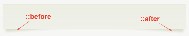
What this does is to subtly rotate each pseudoelement and to place it on its respective side. The parts that have been rotated down are now visible, poking out of the bottom of the .pagecurl div. And, lo and behold, with the ::before element slightly rotated counterclockwise and the ::after clockwise, it creates the uncanny effect of a shadow thrown from a slightly curled page. This is quite an original yet appropriate usage of ::before and ::after. Until now, I’ve only seen pseudoelements used as clearing hacks (think: clearing floated elements without extra markup), but this is a clever implementation highlighting the types of things we can achieve with these rarely used and oft forgotten properties.
Colour me impressed.