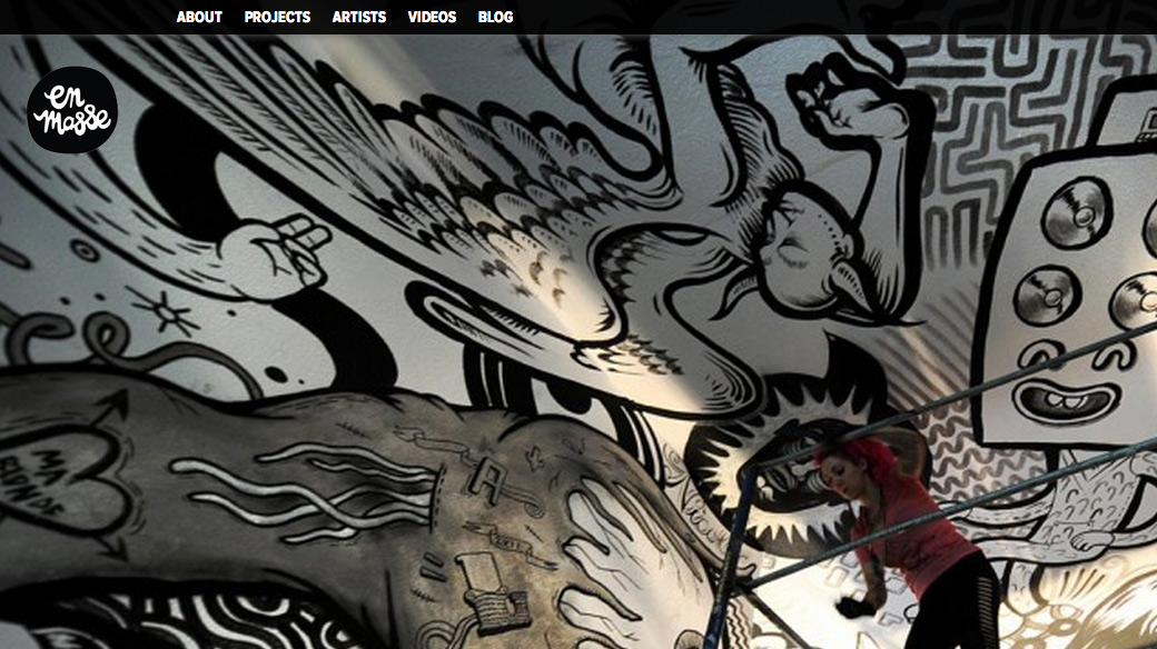
En Masse Collaborative Murals
February 14, 2013 • by colin

We’re proud to have helped Jason Bodkin and Montreal’s collaborative drawing project En Masse redo their website recently. Wes really took the lead in setting up the information structure first, then iterating the design with the help of CelineCelines’ design eye. This was an experiment in live-wireframing, and the experiment was definitely as success. It is still a work in progress, but we’re happy to show the results and so are En Masse.
Here is the simple process we followed to lay out what had to happen.
Step 1: Define the data We make real simple schema of all the information that has to go on the site. EM have so many artist collaborators, different specific drawing projects they’ve done, and photographic and video records of these that this was really going to be an archive for them.
Step 2: Collect the content We provided a simple WordPress interface for Jason to input content into the provided places. He and his team worked through this over weeks because, well, they have A LOT of content.
Step 3: Assess Now that we had a very simple, design-less view of all the content, we could then think about how to display all this is a clear, pleasing way.
Step 4: Make Prettier Self-explanatory: improve the design look and feel, improve the usability, interate improve and repeat. This lasted through many rounds of incremental improvement.
Step 5: Let it Sit Now we have a site that looks finished and beautiful, that we feel is definitely not “finished” as in carved in stone, but is definitely finished in the sense that it does a really great job of presenting the project and accomplishing what En Masse needs to communicate for the next stage of their growth.
Will the site continue to improve and evolve over time along with the organization? Almost certainly.