Rowify Anything
February 02, 2012 • by wes
I’m just in the final throes of completing a site, and it feels great. However, I recently took a moment to survey the bulk of the code I had generated, and I reflected upon the avenues for improvement and refinement. While such a thing is probably not wise immediately prior to signing off on something (as it could potentially lead to untimely code refactoring), I did identify a number of redundancies in my CSS that I thought could be easily cleaned up.
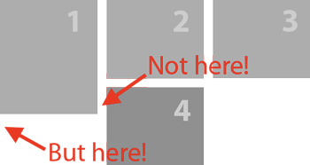
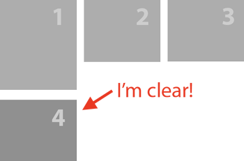
The site design calls for many elements arranged into columns and rows, for which I was using floated <li>’s to generate. The difficulty is that the elements were of unknown (and variable) height, giving rise to a common problem when floating elements: they don’t clear nicely and thus won’t arrange themselves into neat rows.
Early on in the development process, I had solved this issue with a little CSS3 sugar. I like to use the following rule to create “self-clearing” rows:
.somecontainer li { width:220px; margin-left:30px; float:left; }
  .somecontainer li:nth-child(3n+1) { clear:left; margin:0; }
What this particular bit of CSS does, then, is to create rows of 3 elements each, where each element is 220px wide and avoids getting stuck as per the image, above. How this works is by setting the first element of every row (i.e. every “third element plus one”… which works out to be first in the next row) to clear:left. Great, now it doesn’t get caught and clears as it should. Likewise, we could also create rows of only two elements with this bit of simplified CSS:
.anothercontainer li { width:340px; margin-left:40px; float:left; }
  .anothercontainer li:nth-child(2n+1) { clear:left; margin:0 }
Notice the larger <li> widths to accommodate 2 elements as opposed to 3, but the total width works out to be the same. Okay, this is all fine and dandy, but the problem I was facing is that I had had these declarations everywhere, in use with many different containers (“.somecontainer”, “.anothercontainer”, “.yetanotherwithslightvariations”, “.etc-container”). I didn’t like having to rewrite the same rules over and over, with sometimes slight alterations, so I extracted the important bits and rolled them together to get this:
.rowify._2 li { width:340px; margin-left:40px; float:left; }
  .rowify._3 li { width:220px; margin:30px; float:left; }
  .rowify._2 li:nth-child(2n+1),
  .rowify._3 li:nth-child(3n+1) { clear:left; margin:0; }
The slick thing here is that you can give these classes to any <ul> and it will rowify the elements into 2 or 3 per row. For example:
<ul class="rowify _3"> => instant, self-clearing rows !
<ul class="rowify _2"> => the same, but with 2 elements!
The underscore is required because strictly speaking you cannot start a css class name with a digit; also, class names need to be at least two characters long, so the underscore helps there, too.
Okay, and finally, this won’t work natively with Internet Explorer versions 8 and older. However, let me recommend the excellent selectivizr, which I use in all my projects. It adds the ability to use CSS3 selectors in browsers that do not natively support them, and then you to do all sorts of crazy aforementioned fun CSS3 stuff.